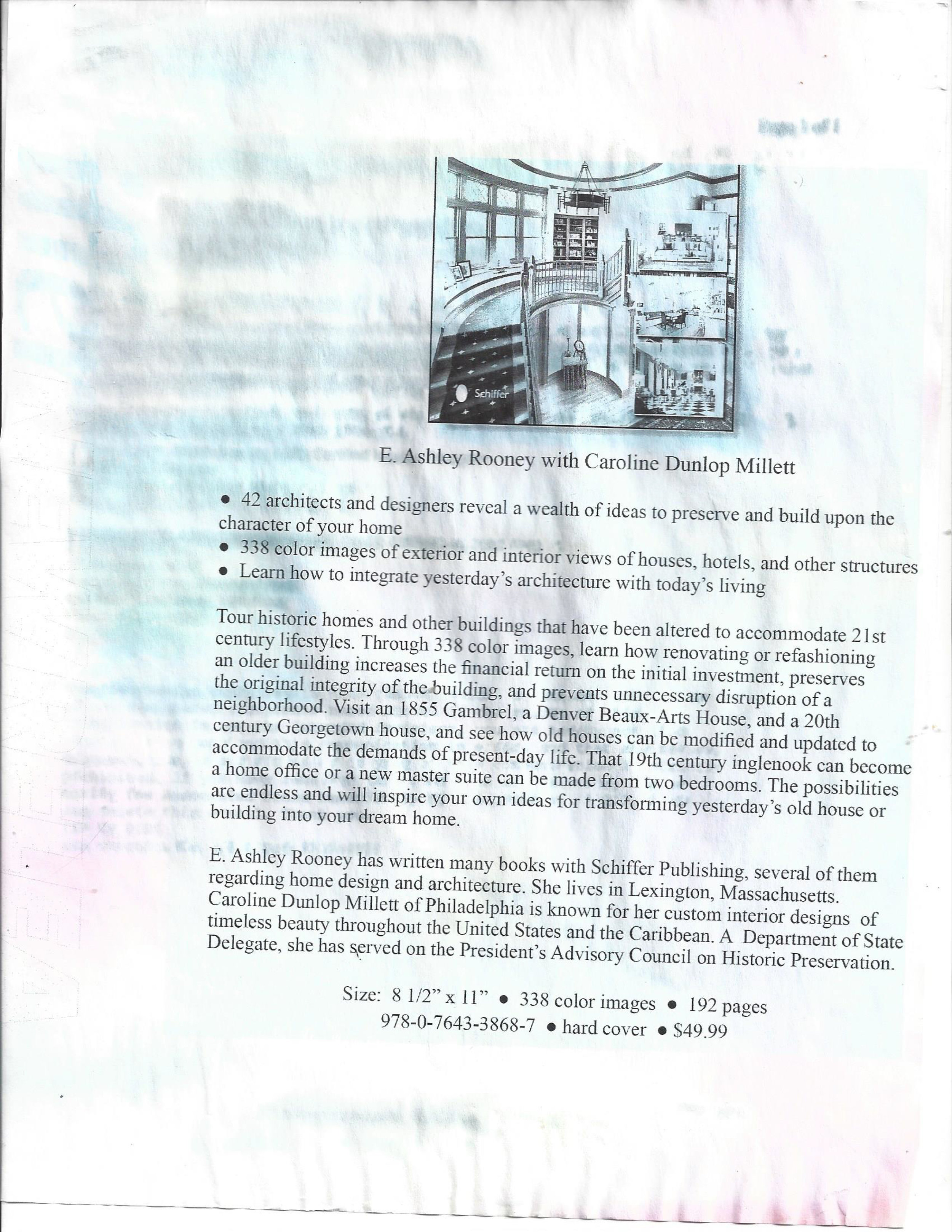
Today's Historic Interiors
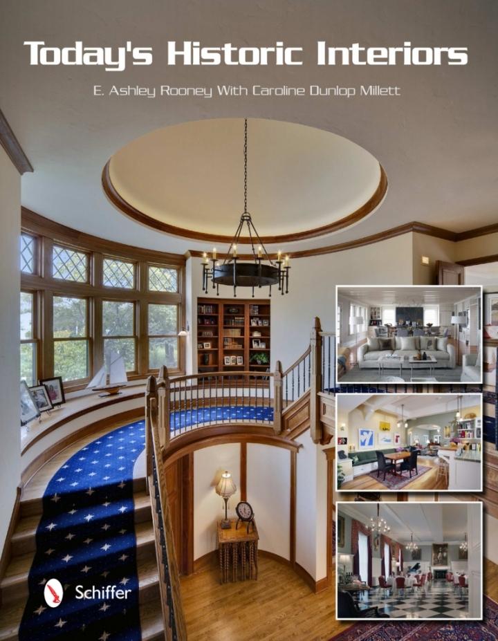
Tour through historic homes, restaurants, and other institutions which have been altered to accommodate 21st century lifestyles while still maintaining the original integrity of the building. Learn how renovating or refashioning an older building increases the financial return on the initial investment and prevents unnecessary disruption of a neighborhood. Featured homes which have been modified and updated to accommodate the demands of present day life include an 1855 Gambrel, a Denver Beaux-Art House, and a 20th century Georgetown house. The work of 42 architects and designers who have restored and renovated homes dating from the 1750's to 1980's is showcased through these rooms. This attractive collection of inspired decor will provide an endless supply of ideas for transforming yesterdays old house or building your dream house.
Written by EA Rooney and published by Schiffer Publishing, Today's Historic Interiors, is a collection of beautifully designed interiors showcasing classic interior design in historic buildings. The objective is to illustrate to readers how to design in historic buildings in order to capitalize on each building's unique attributes yet making each room very livable and integrated for today's home environment.
Colonial Revival Reclaimed
Description of Photos
(This is just a few of the photos to be featured in the book)
A. Front parlor:
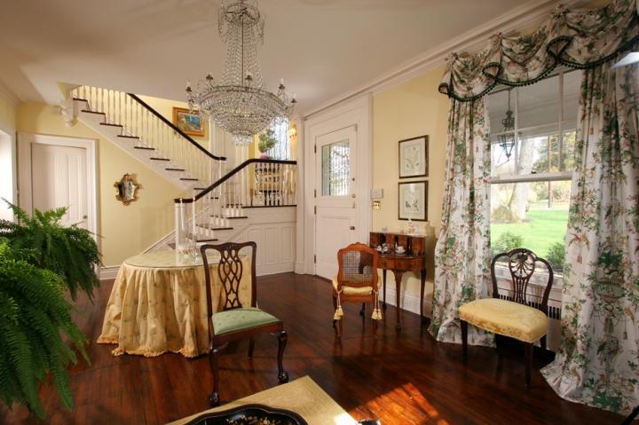
The original purpose of the front parlor as a warm and welcoming reception room was retained through the designer's choices of colors, fabrics and furnishings. The family that originally built the home was French—an influence that can be seen in the home's interior architecture. Ms. Alston paid homage to that in choices such as the non-electrified chandelier from the 1800s and the antique French sofa.
Since the room is both a gathering place and a passageway to other rooms in the house, proper furniture placement was of paramount importance. The restored front door grille, which is black on the outside, was painted white on the inside to match the lightness of the interior space. The window treatments were designed to enhance and frame the view through the front porch and beyond.
B. Stairway
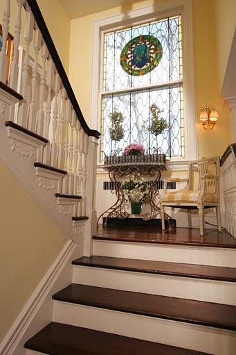
The generous landing provides the perfect place for a vignette that is both beautiful and practical. Because the light is so wonderful, the homeowner delights in reading in this "found" space. The French planter echoes the tracery on the window. The window itself is fully operational, which is unusual for a stain glass window that size in a home built at the beginning of the century.
C. Living room (rear parlor) –fireplace view
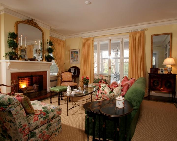
Taking advantage of the architectural symmetry of the room, the designer made the fireplace its visual focus. Tieback draperies both enhance and expose the floor-to-ceiling columns that flank the fireplace. Two opposing mirrors—one over the mantle and the other in the adjacent dining room—create infinity reflections that connect the adjoining spaces and add to the grandeur of the rooms. The sisal rug has a custom tapestry border that echoes the English garden floral fabric used on both tossed pillows and upholstered pieces.
L. Family room
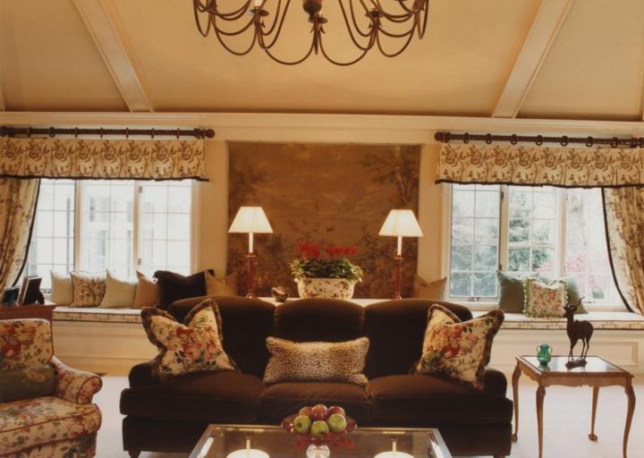
The 20' x 30" foot room has expansive windows, which provide generous light but offer space-planning challenges. To provide storage and to capitalize on the views to the outside, the designer created a window bench that runs the full length of two windows. Floor-length linen toile drapery, banded in the same velvet that graces the sofa, flow left and right to frame the space. A French limestone console table sits behind the sofa, where an antique English brown transfer ware footbath serves as an elegant planter.
Colonial Revival Reclaimed
Description of Property
1903 asymmetrical colonial revival residence updated and enlarged in 1995 with an expansion of the existing kitchen and the addition of a new adjoining family room. The house and addition were structural sound and possessed good circulation flow, however required substantial updating to bring it back to its original grandeur both inside and outside.
Client objectives
The client was seeking to restore the home to its original design intent both inside and outside. They wanted the designer to create a timeless interior suitable for elegant entertaining, yet comfortable for everyday living. The client wanted to create a space that was consistent throughout, flowing gracefully from room to room. A clearly stated design objective in transforming this house into a luxuriously appointed traditional space was to incorporate the use of existing antiques as well as incorporating the purchase of new antiques that were the correct scale and elegance for the homes existing grand architectural details and tall ceilings which ranged from 10 to 11 feet on the first floor.
Design Program
The design program commenced with an evaluation of the client objectives and preferences including space needs and usage, colors, lighting, materials and budget. This permitted the development of design concepts that considered both aesthetic and functional issues. A second plank of the design program was research into the historic relevance of the home through a local historical society. Against the backdrop of stated client preferences and objectives, the primary deficiencies of the space were identified to later be addressed in the design plan. Some of these included:
Exterior:
Investigation at the historical society produced a photo of the home from 1914.
It showed two columns on the front porch which had been removed and beautiful paneled pilasters on either side of the upstairs windows which were hidden by shutters. We designed and installed custom columns, repainted the entire home, replaced missing or damaged architectural elements and removed the shutters.
Living Room:
A previous owner had removed the original French doors from the living room and installed sliding doors inconsistent with the elegant architectural details of the room. New French doors and sidelights were designed to match those in the dining room using hand blown glass and antique cremone bolts.
Kitchen:
A new kitchen designed by previous owners in 1995 was absent of architectural and design consistency with the rest of the home. A few structural changes in the cabinets and a refacing made the space flow seamlessly with the antique part of the home.
Family Room:
A large footprint ( 20' x 30'), tall ceiling of (11') and an unusual number of windows that while providing an excellent source of light, left the space feeling open, vacant and cool. A combination of warm colors, textures, patterns and the proper lighting and placement of furniture corrected this deficiency.
A Storybook Kitchen
Description of Photos
A.
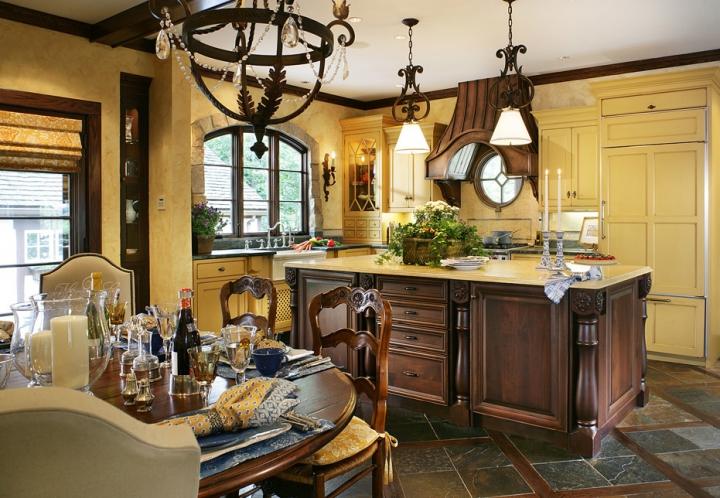
The challenge was to blend a new, fully functioning kitchen with a storybook French Normandy cottage style home. JoAnn Alston of J.Stephens Interiors developed a design plan that did just that. Hand-hewn wood beams and a wonderful mix of textures, patterns and colors are all indicative of French country design. The hand plastered walls, further enhanced by a two-color glaze, gives them the requisite aged appearance which matches the walls in the rest of the house.
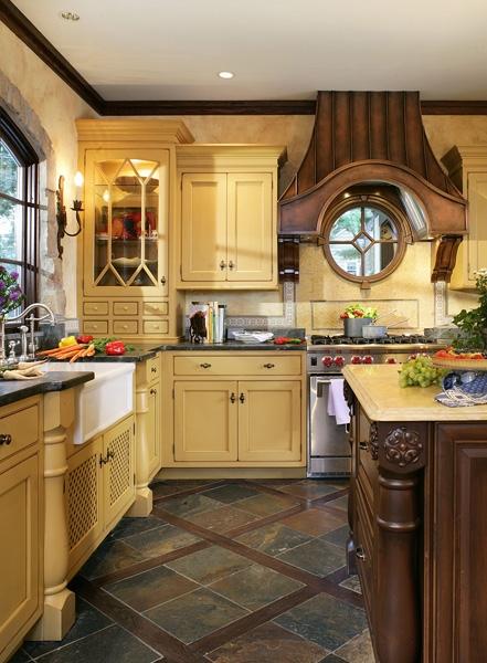
Soapstone was selected for the perimeter countertops because it is subtle, natural, and relatively maintenance free. The dark alder island complements the door casings and beams and provides contrast to the mustard colored cabinets, while the Jerusalem yellow limestone top adds another note of warmth and texture to the room. The floral molding on the island's legs is taken from a design detail on the front door of the home.
B. ( hood shot)
The diagonal slate and wood floor has an antique French Normandy quality that's completely in character with a clients home. To add light and openness to the kitchen in a unique way, a round window with bronze casing was designed to go above the cook top. It offers an unfettered view to the home's back door. The window is cradled by a fully functional copper hood with a beautifully aged finish. The use of interesting doors and windows and a sense of openness to the outdoors that exists in this renovated kitchen are also prevalent in the rest of the home.
A Storybook Kitchen
Description of Property and Client Objectives
A storybook 1920's two bedroom French Normandy cottage style home. The original house was loaded with character and charm including such details as hand plastered walls with molded relief's , hand hewn wooden beams, many original iron light fixtures and charming windows and doors.
The owners are a busy young couple with a growing family who decided to create a four bedroom home with the help of an architect and interior designer. It was most important to them to maintain the character of the original home in the addition. This kitchen was one part of the expansion. The former kitchen was a dreary, outdated. galley kitchen. The client wanted the designer to create an old world, timeless, functional European kitchen.
Design Program
After careful consideration of the clients preferences and objectives, a design program was developed. The designer developed the design details which inc plan and elevations of the kitchen, selection of the style and finish of the cabinets and counters, lighting placement and type, wall treatment, floor design and selection of materials, hood design inc selection of material and finish, furniture plan and selections, drapery design and fabric selection, window design, crown and door moldings and beam design, details and placement The designer met the clients objectives of taking the raw space and creating the perfect old world European kitchen to blend with their house in scale, style and proportion.
The cabinetry elevations and layout introduced functionality to the kitchen. The design details introduced some of the same textures and elements that were in the existing home such as the textured plastered walls, hand hewn wooden beams, and a wonderful mixture of textures, patterns and color indicative of French country design. Using a hand done plaster technique on the walls and further enhancing the application by applying a two color glaze gives the walls an aged appearance. The color of the walls creates a unified warm look and balances the mustard colored cabinets. Soapstone was chosen for the countertops on the perimeter because it is subtle, natural and relatively maintenance free. It also corresponds nicely with the floor materials. The dark alder island complements the door casings and beams and provides contrast to the mustard colored cabinets. The Jerusalem yellow limestone on the island counter adds another note of warmth and texture to the room. The floral molding on the island legs is taken from a design detail on the front door of the home. The appliances are designed to be hidden by using cabinetry fronts that match the rest of the kitchen. The floor was carefully designed to be slate and wood.
The wood boards and design add depth and interest to the room and are relatively maintenance free. The irregularity of the surface provides slip resistancy for safety in the kitchen. The wall and ceiling lighting chosen are all new, designed to look old. The finishes on these pieces all vary but blend to give a look that is collected instead of purchased all at once.
These lights are in addition to under cabinet lighting and recessed lighting in the ceiling. In an effort to add light and openness to the kitchen in unique manner, a round window with bronze casing was designed for placement over the cook top, so that the homeowner could see the back door. The copper hood was designed to add a strong focal point to the room while maintaining its functionality. The use of interesting doors and windows and openness to the outside is prevalent in the existing house.
